
Urban League Website Redesign
Project Overview
The problem
We were tasked with redesigning the website for Urban League of Springfield in Springfield, MA. The existing website lacked storytelling, had outdated information, and poor navigation. One of the biggest issues for the client is that the website does not make it clear who they are or what they do.
The goal
We aimed to improve the Information Architecture and SEO of the site as well as update all of the content and add storytelling while staying consistent with the Urban League brand.

My role
Project Lead
Responsibilities
Project roadmap, organizing project and keeping everyone on track, communication with client, leading meetings, mood boarding, user persona, conducting surveys and interviews, research ideation, design ideation, paper wireframes, mid-fi wireframes, prototyping, usability testing and mockups
Team Roles
Project Lead (myself)
UX Researcher / UX Designer (all 6 teammates)
Project Roadmap
I created a project roadmap with Figjam to help me design how the project would work.

Understanding the User
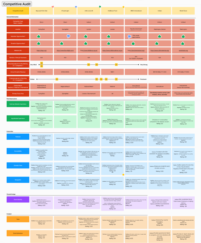
Competitive Audit
We audited 2 direct and 5 indirect competitors. The two direct competitors were local nonprofits in Springfield. The 5 indirect competitors were other similar organizations we found around the world.
User Research
We conducted a user survey and user interviews to get a better sense of how users view the existing website and double check our own biases. We were surprised to find that some user liked the current website and did not find the navigation difficult, however, majority had a number of issues with the current design. Above is the affinity diagram we used to analyze the results.

User Pain Points
We discovered three main pain points from the surveys and interviews we conducted.

User Personas
We created a user personas for each main type of user: volunteer, participant, and donor. This exercise helped us put ourselves in each of the user's perspective. Below is the participant user persona:

User Journey Map
We created a user journey maps for each main type of user: volunteer, participant, and donor. Below is the user journey map for the volunteer persona as they search for more information about Camp Atwater on the Urban League website:


User Flows
We created a user flow for each main type of user: volunteer, participant, and donor. This exercise helped us think through how each user type would navigate the website. Below is the participant user flow:

MoSCoW Method
After creating the user flows, we conducted a MoSCoW method for each user type to help us prioritize what content should be on the website. Below is the participant user MoSCoW Method exercise:

Card Sorting Exercise
From the MoSCoW method, we chose which items we wanted in the navigation bar and then tested it through a card sorting exercise. We had users place each item under the topic they thought it should go. We then compiled our data (below) and used it to create a preliminary information architecture.

Information Architecture
From information we gained from the user flows, MoSCoW method, and card sorting exercise, we built version one of our information architecture.
After our first usability study, we revised the information architecture based on user feedback. Primarily, we changed the dropdown title of “work” to “programs” so navigation would be more intuitive.
Version 1

Version 2

Starting the Design
Ideation: Crazy Eights
The design team participated in a Crazy Eights exercise to help brainstorm ideas for each primary page of the website. We each sketched eight ideas for each page. Below are my Crazy Eight exercises.

Mid-Fidelity Wireframes

We included a CTA at the top of most of the pages to encourage more interaction with the site. Since excess scrolling is an issue on the existing site, we used pills to condense information. We also added navigation cues such as suggested pages, breadcrumbs, and links in the footer.

We used larger drop down menus in order to avoid a double drop down menu which is harder to navigate. This option also allows us to include a short description for each page.

Mid-fidelity Prototype
To prepare for usability testing, the I created a mid-fidelity prototype that connected all of the mid-fidelity wireframes.
View the Mid-Fidelity Prototype

Thank You!
Thank you for your time reviewing my work on the Urban League Project. This project is ongoing. Stay tuned for more updates! If you’d like to connect with me or view more of my work, my contact information is provided below:
Email: caitlinkhan8@gmail.com
Website: caitlinkhan.com

